Chart Your Course to Financial Independence with ProjectionLab
If you’re anything like us, your journey towards financial independence started with a dream and a spreadsheet. From reading books and listening to podcasts, to scouring blogs and forums, it’s always a path filled with learning. And while navigating the complexities of long-term financial planning can sometimes feel overwhelming, with the right tools and guidance it can become an exciting adventure.
That’s where ProjectionLab comes in – our mission is to simplify, clarify, and empower your journey towards FI, with modern and intuitive planning tools that are genuinely fun to use.
In our new walkthrough video Getting Started with ProjectionLab, our founder Kyle Nolan shows how you can start building your own plans for financial independence today.
Our Mission
A few years ago, Kyle set out on a mission to build a better long-term financial planning tool. His goal was simple: to make powerful, intuitive, and privacy-friendly financial plans accessible to everyone… without raising VC, and always putting values and customers first. ❤️
Today, ProjectionLab is still proudly a bootstrapped and sustainable business with clear and simple goals, helping thousands of households take control of their finances, reduce financial anxiety, and confidently plan for the future.
Exploring ProjectionLab
Here’s a quick preview of some of the features Kyle highlights in the video walkthrough.
Dashboard: Gain a bird’s-eye view of your financial situation, with customizable display options.
Current Finances: Manage and update all your accounts in real-time, without needing to link actual financial accounts.
Plugin API: Sync your data effortlessly with popular tools like You Need A Budget (YNAB) or Monarch Money.
Mobile and Desktop Compatibility: Accessible on mobile devices, though a computer is recommended for the most comprehensive experience.
Creating Plans: Start your financial journey with flexible planning options, tailored to your unique situation.
Milestone System: Set and manage significant life events as anchors in your financial roadmap.
Income and Expense Modeling: Build detailed career progression models and capture how inflows and outflows change over time.
Cash Flow Priorities: Strategically balance building emergency funds, making investments, and more.

Real Assets: Capture the true value of your assets and how they change over time, including properties and vehicles, with customizable parameters.
Tax Estimation: Use our automatic US tax estimator, or apply one of our international tax presets, or build your own custom tax config.
Interactive Interface: Experiment with different financial scenarios in an informative and engaging way.
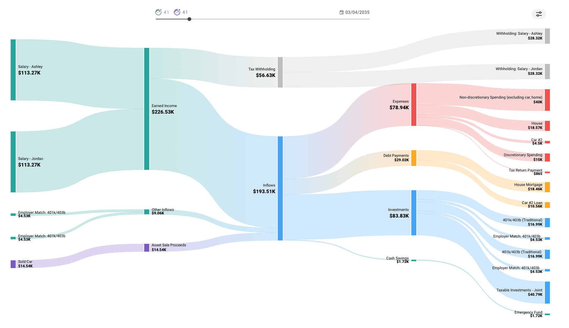
Sankey Cash Flow Chart: Visualize annual money flows to gain detailed insight into each simulated year.
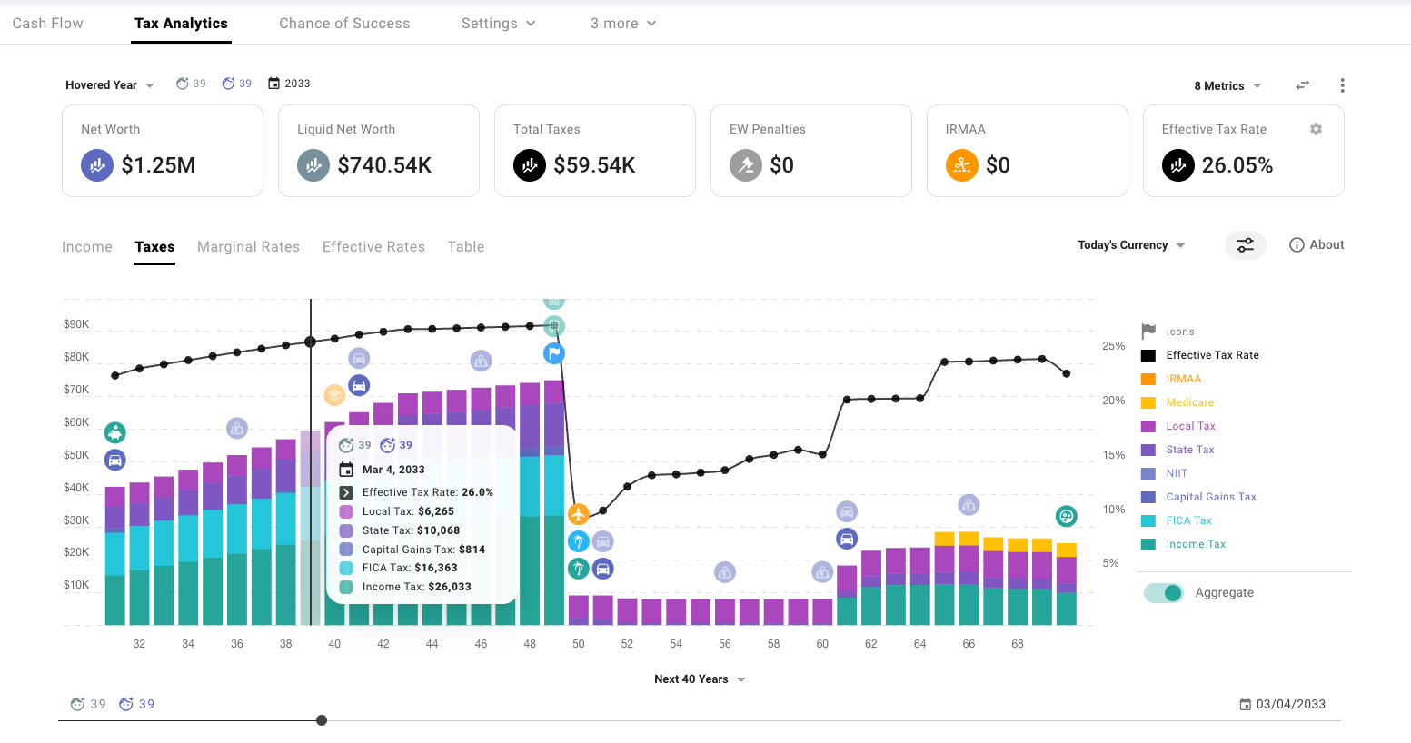
Tax Analytics: Deepen your understanding of tax obligations and opportunities.
Monte Carlo Simulations: Test your financial plans against market volatility and historical data to gauge your chance of success.
Welcome to the Community
We know financial independence is not a one-size-fits-all dream, and neither is the path to get there. We’ve built ProjectionLab to meet you wherever you are on your journey, with a modern and flexible planning platform that can illuminate and evaluate the forks in the road.
But the adventure is better together! If you check out the ProjectionLab Discord Community, you’ll find a wealth of insights and discussion threads with like-minded FI enthusiasts.
We chat with customers daily. We never outsource support. And you can @kyle and he’ll actually reply 🙂
Video Transcript:
Hi, welcome to ProjectionLab. My name is Kyle, and a few years ago, I set out on a mission to build a better long-term financial planning tool. Something that could help people, myself included, assess the different paths in front of them and build confidence in a life plan that they’ll really enjoy.
In this video, we’ll do a quick overview of ProjectionLab and build out an example scenario to help explore some of what you can do with it. But here, we’re really just scratching the surface. So if you’d like to see more advanced tutorials on specific topics, please let us know in the comments.
At its core, the planning experience in ProjectionLab really ties together all of your future income streams and expenses, patterns of buying and selling real assets, projected taxes, and financial goals in a visual and interactive way that’s fun to experiment with and allows you to plan for your best life. With a deeper understanding of the spectrum of possible outcomes comes, but without further ado, let’s jump in.
There are a couple of different ways we can get started. If you’re serious about learning the tool, I would recommend the normal walkthrough. But if instead you’d like to get a quick sense of what ProjectionLab looks like, you can hop into the sandbox. Just to show you how the sandbox works, we can pick an example persona here and launch into that. You can see that everything is fully populated, and there are some example plans that you can explore. But since we would rather do the normal walkthrough instead, let’s head over to account settings, delete the example data, and start over.
Let’s say we’re planning as a couple, and we’ll add some names just for fun, maybe Ashley and Jordan. Let’s say that this couple has some savings, some existing investments, maybe they bought a house recently, and perhaps they’ll have some student loans that we’ll model too. So, for savings, let’s say that they have an emergency fund built up and also a checking account. For investments, let’s say that they have some joint taxable investments. In the interest of time, let’s skip ahead a little bit, and I’ll populate some things for us to talk about.
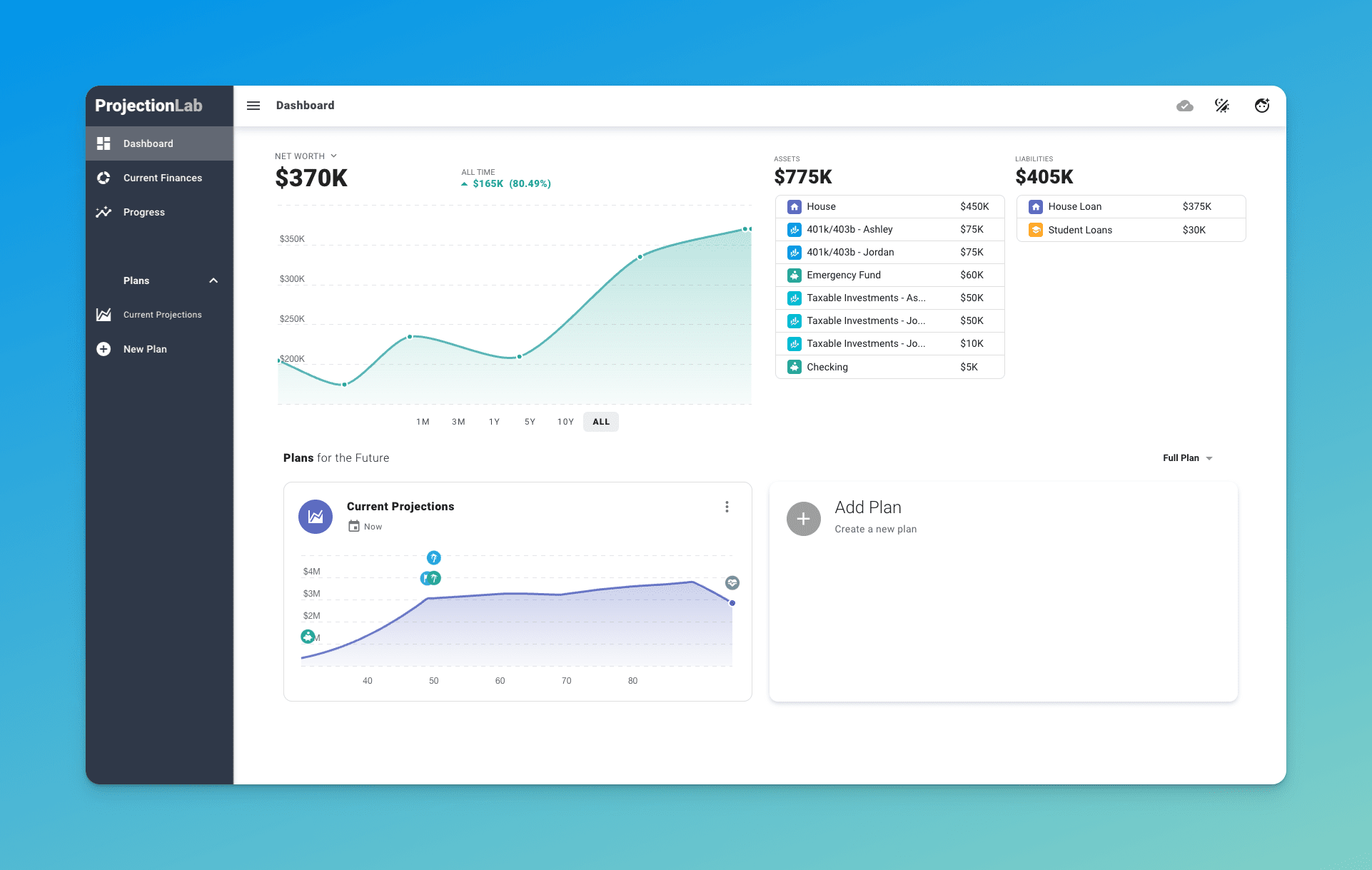
This is what the dashboard looks like. Here we can see a breakdown of our current assets and liabilities at the top, along with a chart that shows our historical net worth progression over time. And if we want, we can make that chart a little bigger. There’s also a dark theme if that’s something that you’re into.
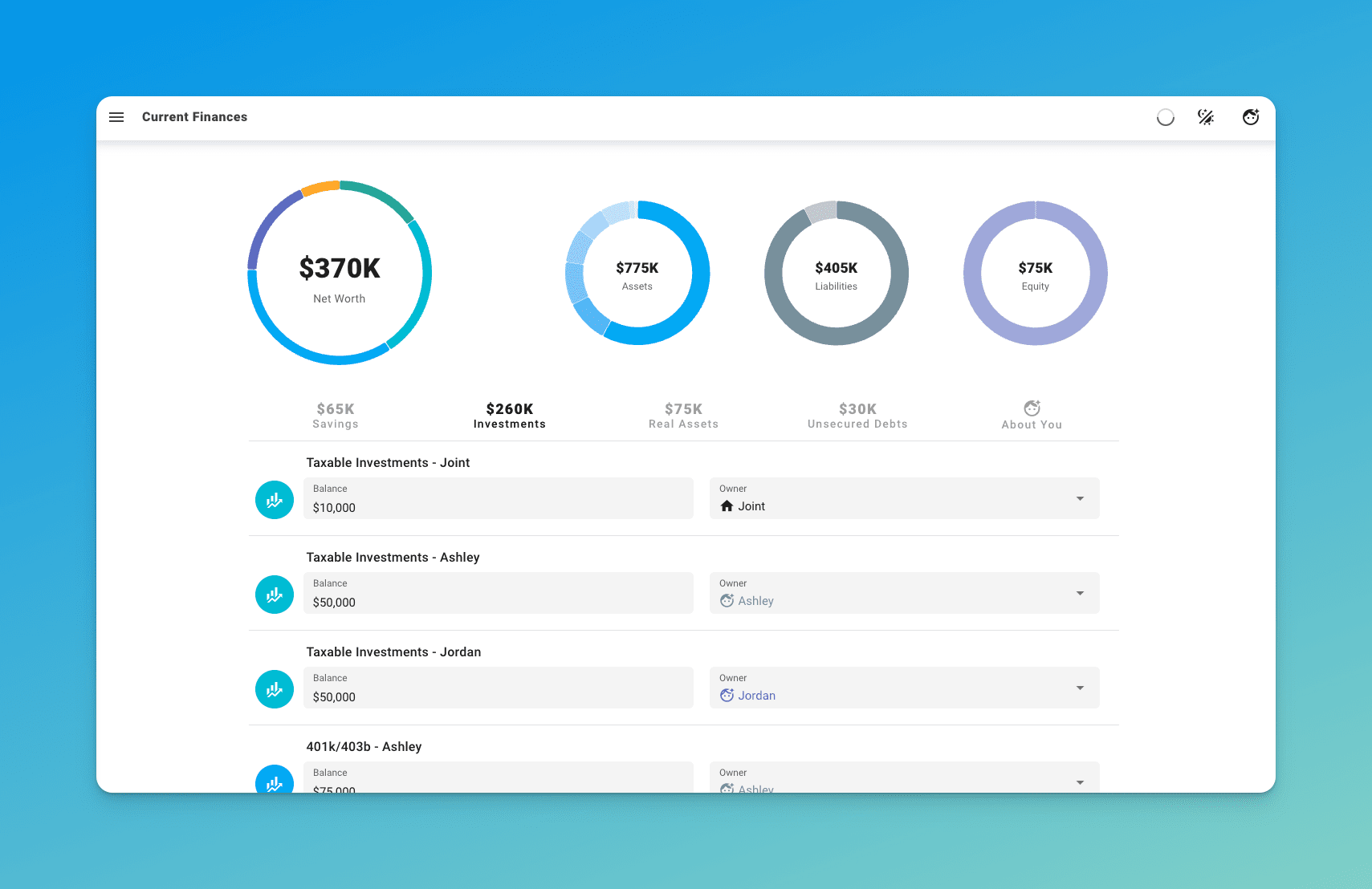
You’ll notice that front and center here on the dashboard are the plans and projections that we’ve made for the future, and we’ll circle back to those in just a second. Over on the current finances page, this is where we can see and edit all of our accounts. As time goes by in the real world, this is where we’ll make updates to reflect that, with no need to link your real financial accounts.
It’s also worth mentioning that ProjectionLab now has a plugin API you can find on the account settings page, so you can sync balances automatically from other tools like You Need A Budget or Monarch Money, and there are more plugins on the way.
Anyway, each time current finances gets updated, that will automatically create a new progress point that gets saved over on the progress screen. Here, I should mention that the app does work on mobile too, but personally, I would recommend setting things up on a computer if you have one since the extra screen real estate can be helpful.
Now let’s talk about plans because what we’re really here to do is make projections, right? We can create a new plan like this, and there are a couple of options when setting these up. What I usually do is have my plans always project from today forward, which automatically pulls in the latest data from current finances.
But if you find yourself really preferring to think in terms of calendar years instead, one thing that you might like to try is creating a fixed date plan with a start date of January 1, which might make the labeling a little bit more intuitive for you. But in this case, we’ll just spin up a typical now plan.
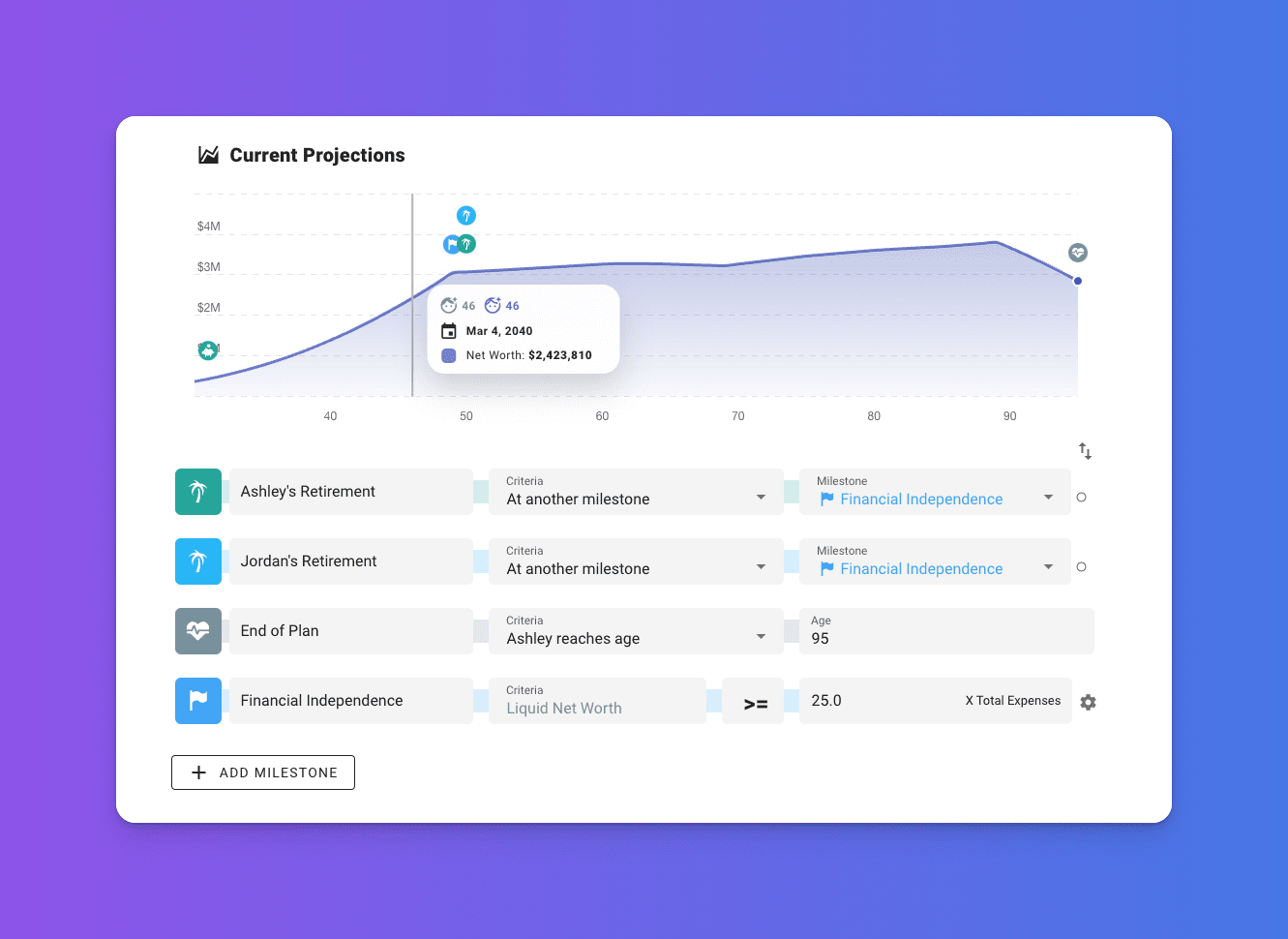
What I’ll do here is prepopulate most of this plan for us so that we can move through the sections at a good clip. The first major touchpoint here is the Milestone system. This is where we can capture some of the big picture events and stages of life that we care about, and the conditions for when they occur. That could be things like achieving whatever our definition of financial independence is, the year that we might buy our first home, or have a kid, or move to a state with lower taxes.
The Milestone system is pretty flexible and customizable, and for each milestone, you can click the icon to see an options menu with even more things you can do. We could change the icon or the color, add tax consequences, or additional criteria. The really important thing, though, is that you can use the milestones you create as a framework to help scaffold the rest of your plan and control when all the different events in your plan should start and stop.
So later, when we’re setting up income streams and expenses, we can bind the start and end date of those things to any of these milestones that we create. Next, we’ll define some investment growth and inflation assumptions at the plan level, and later you can override these for individual accounts if you want to. We can choose to use fixed rates or a specific historical sequence of returns with a certain lookback year if it runs out of data, or design our own sequence of returns if we want.
There’s an advanced interface where we can plug in exactly how things change over time. For the standard plan view, though, let’s just use some simple fixed rates for now to start with. But note that if you really want to battle test your plan against a broader set of varying market conditions, that’s where a chance of success mode is going to come into play later on.
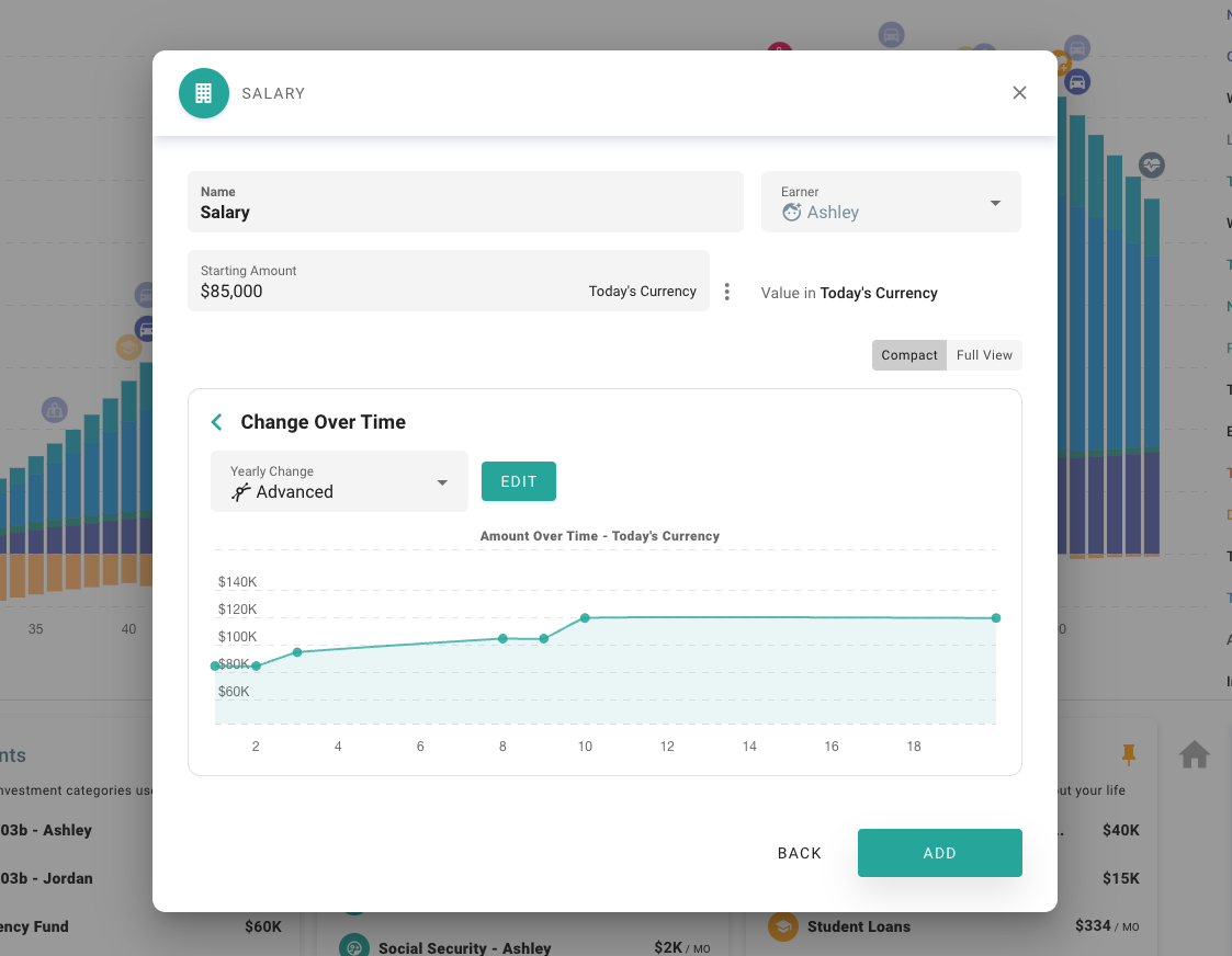
So here we have the sources of income for this plan, and remember I’ve prepopulated some of this stuff for us, but let’s take a look at some of these items. So this one, we have Ashley’s salary. It’s going to start at 85k in today’s currency and it’s in effect from now through Ashley’s retirement. This is an example of one of those milestone bindings that I talked about.
The change over time section is an important one to get familiar with. Here we’ve specified that we want this income stream to increase a little bit above inflation, up to a maximum of 120k in today’s currency, meaning inflation-adjusted currency. There’s a whole bunch of other ways that we could define things changing over time if we wanted to, and there’s even an advanced interface which we could use to map out a really specific career progression if we had something in mind, either in terms of a percent change per year or a percent change beyond inflation, or specific values in today’s currency or actual currency. But we’ll just leave this as we had it for now.
We’ve also got Jordan’s salary and social security income streams for both of them. And next up are cash flow priorities. Now, it might be tempting to gloss over this section, but it’s actually one of the most important pieces of your plan because this is where you’re telling the simulation engine what you want to do with your money.
You can see here we have the top couple of priorities are 401K contributions for Ashley and Jordan. If we go into these, we can see that we’re contributing 15% of earnings, the employer contributes 4%, and that’s up to the US limit. Similar config for Jordan, and then after those two, we have this priority to build and maintain an emergency fund with the idea of building up to a target balance of 60k in today’s currency and trying to keep that topped up. And then anything left over goes to this priority to try to maximize contributions to taxable investments.
And now we get to model all of the expenses that we foresee throughout the plan. You can see that I’ve chosen to break things out into like we have one item for non-discretionary spending here, we have another item for discretionary spending, both of these are increased to match inflation and happen throughout life. We’ve got the payments for the student loans, we’ve got some travel during retirement which goes into effect starting at the retirement milestone, and then we’ve got some long-term care costs that we’re modeling in here too.
This is where we model real assets like houses and vehicles, each includes some default expense assumptions that you can customize. So for instance, if we go into the house, for there’s an expenses subsection which includes some assumptions about like taxes, maintenance, improvement costs, insurance, and things like that that we can tweak if we want to.
Another cool thing that you can do here is set up recurrence patterns, which can be useful to model things like buying a new car every X years. So in this case, we have this car that’s defined to be purchased now and sold 10 years from now, and by setting up this recurrence pattern, we’re going to model buying a new one of these every 10 years.
And then the last thing that we’ll do in the setup process is define how we want taxes handled. Here, we’ll just use the automatic US tax estimator, but there are also customizable presets for a variety of international locations.
Alright, so we’ve finally set up a plan and made it to the full interface. Let’s get oriented. Right now, we’re on the plan tab, and we’re looking at a plot of net worth over time. The little icons above the chart correspond to when key events or milestones start and end, and we can click any year in the chart and see a report of what happened in that year within the yearly summary pane to the right.
You can see this pane includes a bunch of different metrics, and each of these is expandable so you can drill into the underlying line items. For instance, if we wanted to get a sense for what our taxable income looks like in a given year, we can open up the taxable income panel and drill into income and any applicable deductions. Similarly, we could expand the net worth panel for a specific year and see what that’s composed of.
In the chart options menu, there are loads of ways you can customize how things are presented and what data sets are shown, but I’ll leave that for you to explore. One thing that does trip people up occasionally is the distinction between today’s currency and actual currency. Right now, we’re looking at all output from the simulation engine presented in today’s currency, meaning that results are adjusted for inflation over time.
If you prefer to think strictly in nominal terms instead of inflation-adjusted terms, you might like to use this switch to set all the simulation output to be presented in actual currency. Personally, though, I use today’s currency most of the time since I find it a little easier to reason about everything in my plans in terms of what a dollar can buy today.
If we’d like to explore some of the other plots, we can click here and choose from some of the other built-ins. I like the Stacked by Category plot quite a bit because you can easily see how the high-level composition of your assets changes over time. And we won’t really go into this here, but you can create custom plots as well using whatever metrics you like in chart options. You can even flip things over to a tabular view if you want and export data to CSV and things like that.
And beneath the chart on the plan tab, this is where we’ll find all the accounts and income and expenses and real assets and cash flow priorities that we set up during the original plan wizard, so this should look familiar. And each of these can be adjusted at any time, and we’ll see the results of those adjustments reflected right away. Sometimes it can also be useful to temporarily exclude an item from the simulation, and you can do that pretty easily by just clicking the events icon. I’ve built the interface in a way that encourages experimentation and hopefully makes it fun to try things out and explore different scenarios.
In the app bar at the top of the screen, I should point out that there are some useful shortcuts and controls. We can see and edit each of our milestones and likewise our current growth and inflation rates. Maybe we want to see how sensitive our plan is to that investment growth rate changing. We could click into here and then use the slider to try out some different values and see right away how the plan responds.
Or maybe we’re worried about the possibility of higher persistent inflation or something. We can grab this input and experiment with that.
Next up, over on the Cash Flow tab, the Sankey chart here shows a nice visual breakdown of how money flows into and out of your plan in each year of the simulation, and we can use the slider at the top to scroll through and look at different years over time.
Next, on the Tax Analytics page, we might have a separate video do a deep dive on this, and if you’d like to see that, let us know in the comments. But here’s the basic idea. Up at the top, we have a number of different metrics which either reflect the plan total or the value for a specific year when you’re hovering in the chart.
You can select from a variety of additional metrics to show and rearrange them on the page if you like. On the first tab here, we can see the composition of all the kinds of income that will occur throughout the plan. Similarly, we can click on the Taxes tab to see what kind of taxes occur in each year, and there are also plots of marginal and effective tax rates as well.
And you can even create custom table views if you prefer to see things in that kind of format. Further down, when we select a specific year in the chart, we can explore a visualization of all the brackets and rates and kinds of taxes that apply to each category of income. And note that these effective brackets bake in the effects of things like deductions.
There are some chart options that we have to choose from, like whether income sources should be aggregated or not, and below, we can visualize the effective tax rates by income category as well.
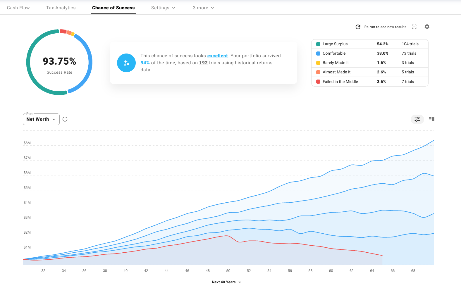
So around now, we might stop and say, “Alright, this is neat, but the real world doesn’t have fixed investment growth rates or a static sequence of returns, so how do we know if the plan that we’ve made is resilient at all to a broader range of more volatile market conditions?” That’s where the Chance of Success tab comes in handy, which lets us run Monte Carlo simulations or backtest against historical data.
In our data sources setup, we can choose to use historical data or custom probability distributions. We can customize the sampling methodology, choose what metrics we want to visualize, decide how categories of outcomes should be presented, and how we personally feel about different success rates.
Alright, let’s kick off a run and see what happens. So it seems like our plan in its current form is fairly solid. The chart in the center here shows the range of outcomes by percentile for the selected metric, which we’re looking at net worth at the moment. And if we want, we can see a split view showing the distribution by age as well.
We can see statistics for each metric of interest split at a certain milestone, along with a table showing the occurrence rate for each milestone and when they are likely to occur in the plan. So for instance, we can see that financial independence, here in like the top 25% of scenarios, might occur as early as age 45 or as late as 55 in the bottom 1%.
There’s also a table where we can explore each individual trial that underpins the larger simulation, so if we find one that failed, for instance, we could drill into that and see exactly where things started to go wrong in this case and why.
It’s also worth noting that within plan settings, there are a number of sections that you might like to explore, such as the drawdown tab, where you can define and customize the sequence for when various categories of assets are withdrawn from. Or perhaps the bonds tab, where you can define a portfolio-level bond allocation that varies over time.
Zooming back out, there is so much more that you can model and experiment with in ProjectionLab than we have time to cover in this video. But I hope this has been a helpful cross-section of features to touch on and that it’s been a useful primer for going off and starting to build your own more nuanced models and scenarios.
If you get stuck or run into any trouble, always feel free to reach out, and I’d recommend joining the ProjectionLab Discord community too, which is pretty active. It’s got a lot of searchable Q&A and discussions, and there are a lot of experienced community members on there who know the tool well and can help out to answer questions.
So thanks for watching, and make sure to subscribe for future how-to videos, updates, and whatever else you’d like to see.

Disclaimer: The content, tools, and resources on ProjectionLab.com are intended solely for informational and educational purposes and should not be construed as professional financial or investment advice. Our materials are designed to provide general guidance and are based on the input and data provided by users. ProjectionLab makes no guarantee of the accuracy, completeness, or applicability of this content to individual circumstances. Effective financial planning and investment involve comprehensive consideration of a wide array of personal financial factors. The tools and resources available on ProjectionLab are aimed at helping users develop an understanding of their financial trajectory. However, they should not be solely relied upon for creating a complete financial plan. We strongly recommend consulting a financial services professional who can provide personalized advice based on your unique financial situation before making any significant financial decisions. While we endeavor to keep the information on ProjectionLab current and accurate, the content may differ from that found on other financial institutions, service providers, or specific product sites. All content and tools on ProjectionLab are provided without any guarantees or warranties of any kind.