New Year, New UI
Discover the latest enhancements in ProjectionLab Version 2.4.0, featuring a sleek new UI and improved modeling features for a better financial planning experience.

Happy New Year everyone! ProjectionLab Version 2.4.0 is live, bringing with it a newer and cleaner user interface, plus a few features to help you fine-tune your models.
Plan Screen Update
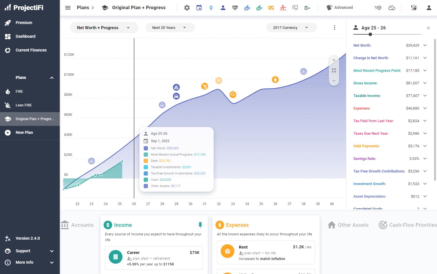
The first thing you’ll notice is the plan screen:

It has a flatter design with less visual clutter, without compromising on the number of quick-access tools at your fingertips. There’s a new charting library under the hood with better animations, keyboard shortcuts, and a slider for stepping through simulated years, clearer layouts with more form options, and many more small improvements!
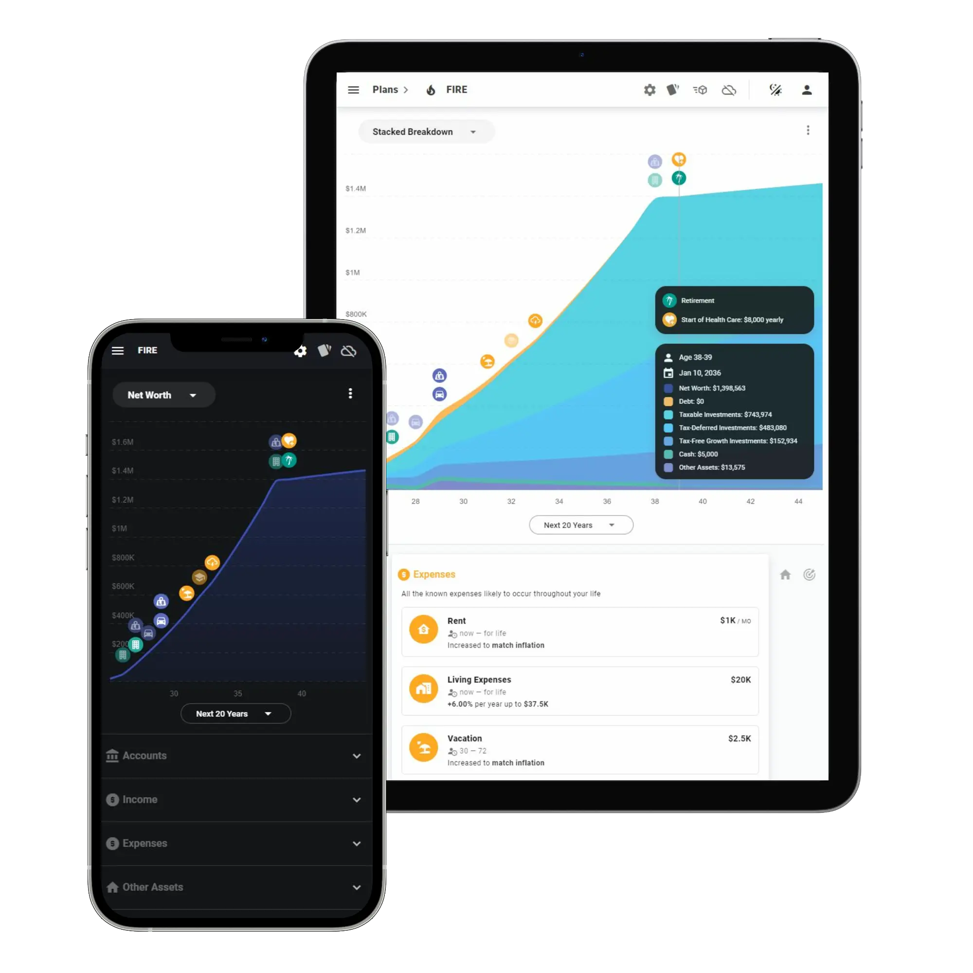
Mobile and Tablet Views
Mobile and tablet views have seen a refresh too:

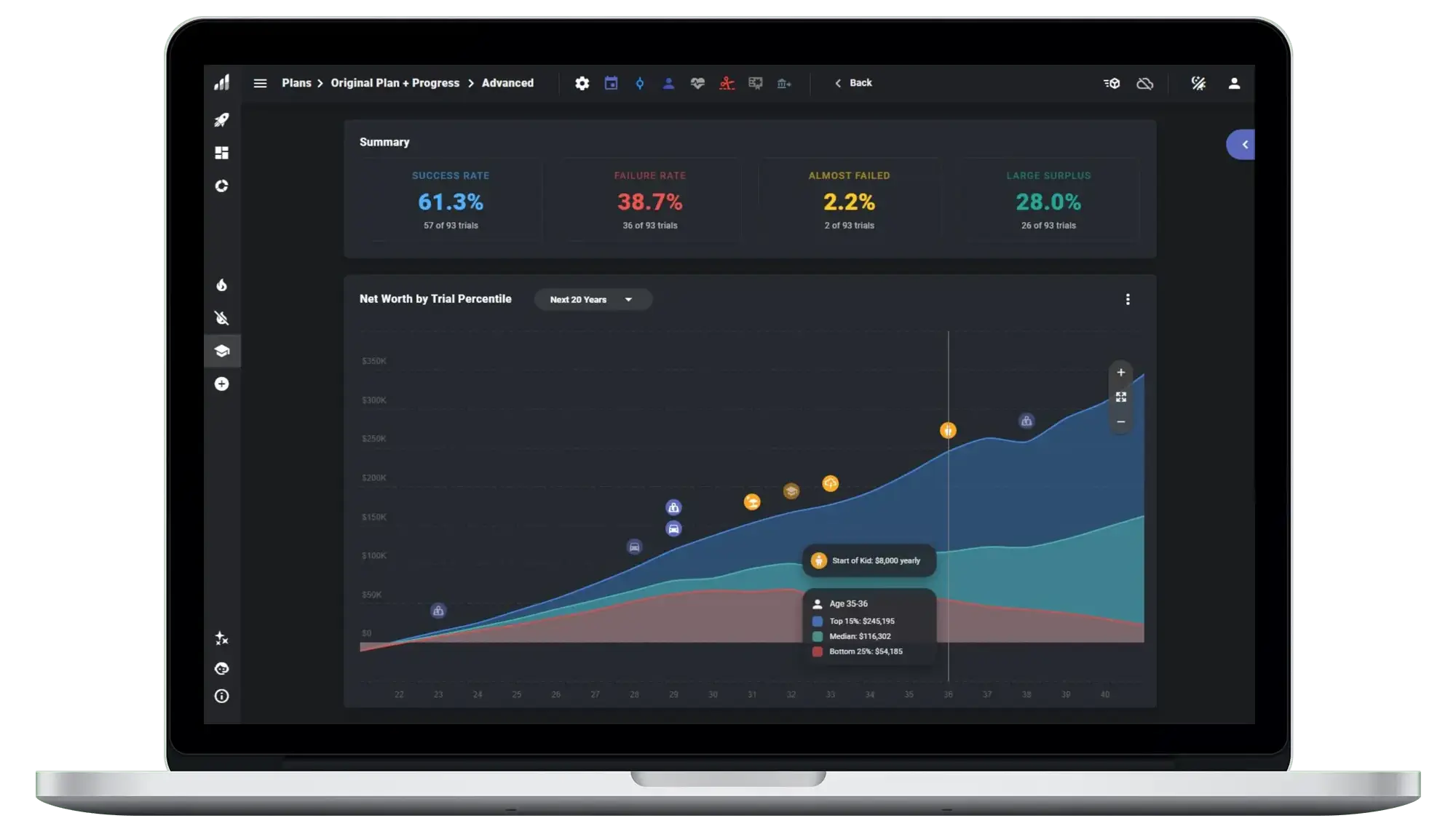
Monte Carlo Mode Updates
And Monte Carlo mode has been de-cluttered and re-colored. Percentiles are color-coded by the same criteria as the stats in the Summary panel, and the app now remembers what datasets and percentiles you had selected between sessions.

More Specific Start and End Years
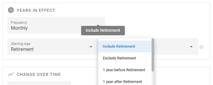
You can also get more specific when you choose start and end years:

Each age input comes with a set of modifiers you can use to anchor things more precisely in time relative to key events in your life.

Future Plans: Age Variables
This also lays the foundation for a planned feature called Age Variables, where you’ll be able to add whatever key-value pairs you want to the age dropdowns (e.g., Start College: 18, End College: 22), bind multiple events to those in your plan, and then have everything adjust automatically if you change the underlying ages. More on that soon :)
Hop into the ProjectionLab app and check out the updates! If you have questions, feedback, or suggestions to share, you can reach me at kyle@projectionlab.com, or @scuba-kid on the ProjectionLab Discord Server.
Disclaimer: The content, tools, and resources on ProjectionLab.com are intended solely for informational and educational purposes and should not be construed as professional financial or investment advice. Our materials are designed to provide general guidance and are based on the input and data provided by users. ProjectionLab makes no guarantee of the accuracy, completeness, or applicability of this content to individual circumstances. Effective financial planning and investment involve comprehensive consideration of a wide array of personal financial factors. The tools and resources available on ProjectionLab are aimed at helping users develop an understanding of their financial trajectory. However, they should not be solely relied upon for creating a complete financial plan. We strongly recommend consulting a financial services professional who can provide personalized advice based on your unique financial situation before making any significant financial decisions. While we endeavor to keep the information on ProjectionLab current and accurate, the content may differ from that found on other financial institutions, service providers, or specific product sites. All content and tools on ProjectionLab are provided without any guarantees or warranties of any kind.

