What is a Sankey Cash Flow Diagram?
A Sankey cash flow diagram is a flow chart where band width matches the money moving through it, showing how income splits into taxes, savings, and spending.
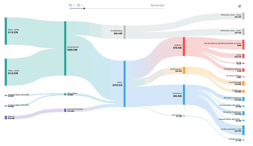
A Sankey Cash Flow Diagram is a flow chart where the width of each band is proportional to the amount of money moving through it, showing how income splits into taxes, savings, and spending. The wider the band, the more money flows along that path, so a single glance tells you where the bulk of your income actually goes.
The format is named after Matthew Sankey, an engineer who used it in the 1890s to chart the energy efficiency of steam engines. The same idea maps cleanly onto personal finance: income enters on the left, branches through categories in the middle, and lands as spending, saving, or taxes on the right, with the thickness of each stream sized to the amount.
How to Read a Sankey Cash Flow Diagram
Read it left to right. On the left are your income sources: salary, side income, investment income, anything that brings money in. These merge into a central pool, then split apart into where the money goes.
Each branch carries a share of the total, and its width reflects that share. A thick band running from your paycheck to housing means rent or mortgage eats a large slice of what you earn. A thin band toward savings means little is left over after everything else. Because every outflow has to come from an inflow, the widths on both sides balance, and nothing disappears without a visible path.
Color usually encodes category. Income streams share one color family, essential spending another, discretionary spending another, and savings or investments another. That lets you spot the overall shape of your finances without reading a single number: a healthy plan shows a visible band flowing into savings, while a strained one shows nearly everything flowing back out as spending.
Why Use a Sankey Diagram for Personal Finance
A spreadsheet can hold the same numbers, but a table asks you to add up rows to understand proportion. A Sankey diagram shows proportion directly, which is why it has become a popular way to visualize a budget or a full year of cash flow.
It is particularly good at surfacing a few things a list of transactions hides:
- Where the money concentrates. The widest outflow band is your largest expense, whether or not it is the one you worry about most. Fixed costs like housing and taxes often dwarf discretionary spending.
- How much actually reaches savings. The band flowing into investments or savings is your real savings rate, drawn to scale next to everything competing for the same income.
- The effect of a change. Widen the salary band or narrow a spending category and every downstream band re-sizes, so you can see how a raise or a cut ripples through the rest of the picture.
Because taxes appear as their own band drawn from gross income, a Sankey diagram also makes the gap between what you earn and what you keep visible in a way a take-home-pay figure never does.
Building Your Own Cash Flow Diagram
At minimum you need three things: your income sources and their amounts, your spending grouped into categories, and the amount you save or invest. Those become the left nodes, the middle branches, and the right endpoints of the diagram.
You can build one by hand with a charting library or an online Sankey generator, feeding it the flows as source, target, and value triplets. That works for a one-time snapshot but gets tedious to maintain, since every change to your income or spending means re-entering the data.
For an ongoing view tied to a real plan, you can visualize your cash flow as a Sankey diagram in ProjectionLab, where the chart updates as you adjust income, expenses, and savings, and extends across future years rather than a single month. That turns the diagram from a static picture into something you can use to test decisions before you make them.
Frequently Asked Questions
What is a Sankey diagram used for? Showing how a quantity flows and splits between stages, with each band sized to the amount it carries. Beyond personal finance, they chart energy use, website traffic, supply chains, and voter migration. In budgeting, the quantity is money, and the diagram maps income as it branches into taxes, spending categories, and savings.
How do I make a cash flow Sankey diagram? List your income sources and amounts, group your spending into categories, and note how much you save. Each of those becomes a flow defined by a source, a destination, and a value. Feed those flows into a Sankey generator, charting library, or a planning tool that draws the chart for you and re-sizes the bands automatically when your numbers change.
What’s the difference between a Sankey diagram and a budget? A budget is the underlying plan for how income should be allocated; a Sankey diagram is one way to picture it. The budget lives as numbers in a list or spreadsheet, while the diagram renders those same numbers as proportional flows so the relationships are visible at a glance. You still need the budget’s figures to draw the diagram.

Disclaimer: The content, tools, and resources on ProjectionLab.com are intended solely for informational and educational purposes and should not be construed as professional financial or investment advice. Our materials are designed to provide general guidance and are based on the input and data provided by users. ProjectionLab makes no guarantee of the accuracy, completeness, or applicability of this content to individual circumstances. Effective financial planning and investment involve comprehensive consideration of a wide array of personal financial factors. The tools and resources available on ProjectionLab are aimed at helping users develop an understanding of their financial trajectory. However, they should not be solely relied upon for creating a complete financial plan. We strongly recommend consulting a financial services professional who can provide personalized advice based on your unique financial situation before making any significant financial decisions. While we endeavor to keep the information on ProjectionLab current and accurate, the content may differ from that found on other financial institutions, service providers, or specific product sites. All content and tools on ProjectionLab are provided without any guarantees or warranties of any kind.